DESIGNS ARE SOLUTIONS
A design solution meets multiple requirements, manages trade-offs and solves multiple problems — simultaneously. They could be technical, creative or a mix. They could be objectively verifiable, or not. They could be hard to estimate or only verifiable subjectively.
A comprehensive design solution takes all of these things in account and delivers something other than itself. In other words, a design often acts as a vehicle for something else, e.g. content. Design gives function a form.
Graphic Design creates a form for content.
A good graphic design solution should be:
- Attractive - it should invite and engage us. That doesn’t necessarily mean "pretty", but drawing the eye is a functional requirement.
- Communicative - it should help us understand what it’s about, what it’s for, who it’s for and why we should look at it. In other words, it implicitly creates or reinforces a context for what is being presented.
- Affective - it should affect us emotionally, convey the right tone, e.g. calming, motivational, authoritative or whimsical.
A competitive environment usually demands consideration for branding, individuality and freshness — while retaining some elements for consistency. The skillful use of consistency and variation have the power to direct our attention, spark our recognition and even charm us.
Of course I think design makes a difference. The difference is whether we notice something (or not), feel something (or not), and whether we like something (or not).
DESIGN BY GRID

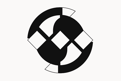
My logo superimposes a radial grid on a square grid. The square grid is rotated 45° and a concentric radial design is aligned on the intersections.
Requirements:
- Express my initials: "WS"
- 1:1 Aspect ratio.
- Be distinctive and interesting.
- Be recognizable at a small size and low contrast.